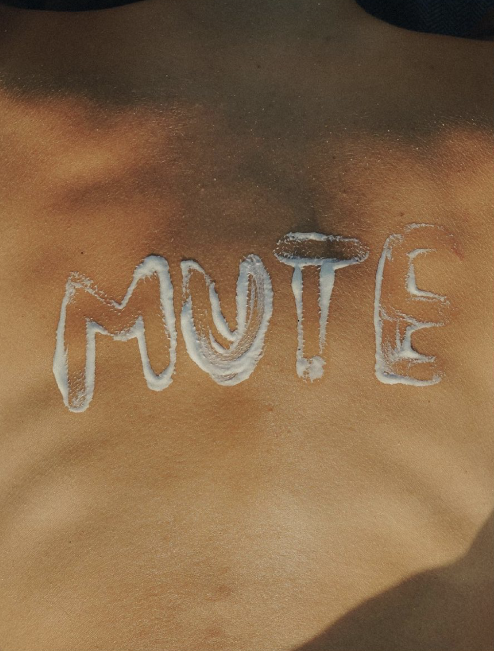
Not a hotel. Not a hostel. Not a guesthouse. Not a surfhouse.
What is MUTE anyway?

It’s a button. An off button. That turns off the routine, the stress, the corporate world, the city. And turns on nature, calm and focus. Mute is therefore a name that goes beyond silence. A place where we disconnect from everyday problems and enter a different mode. We created Mute’s visual identity, naming, branding, design and wrote copy for them, including the brand’s concept – Active resting – and its manifest.


Design & Copywriting

ACTIVE RESTING

MUTE is relaxing the mind, not the body.

By promoting active vacations, it was possible to create posters with headlines that transpired this same dichotomy.

Through the photos overlapping, we were able to reach this confused calm, which ended up transmitting the concept "Active Resting".


The Manifest

If you can’t breathe, change your habitat.

Kill your routine, by waking up earlier.

If you need a break, break up with your habits. 

Overcome your stress, by worrying less.  

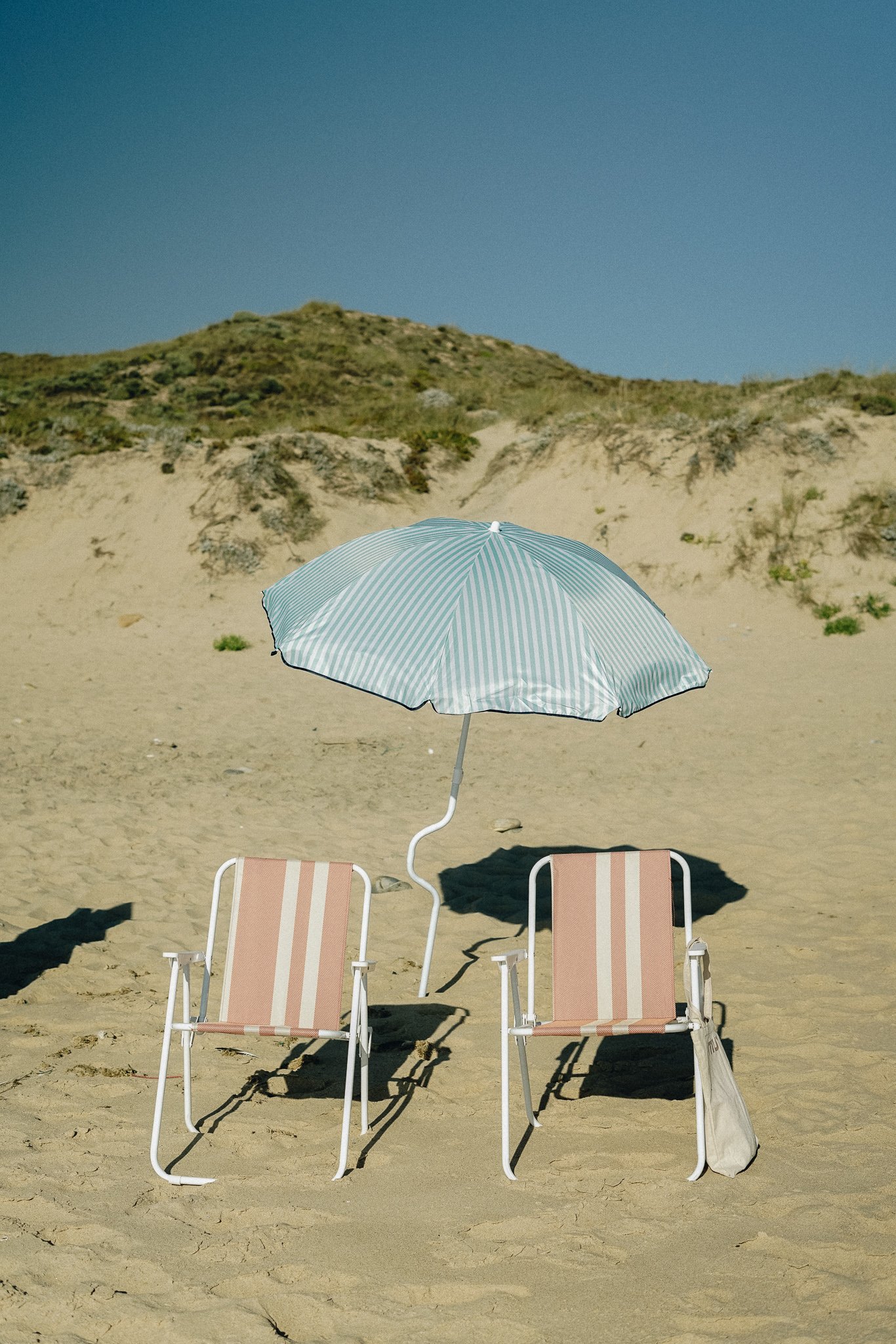
You can’t, because your schedule is tight? Forget it, come catch some light.

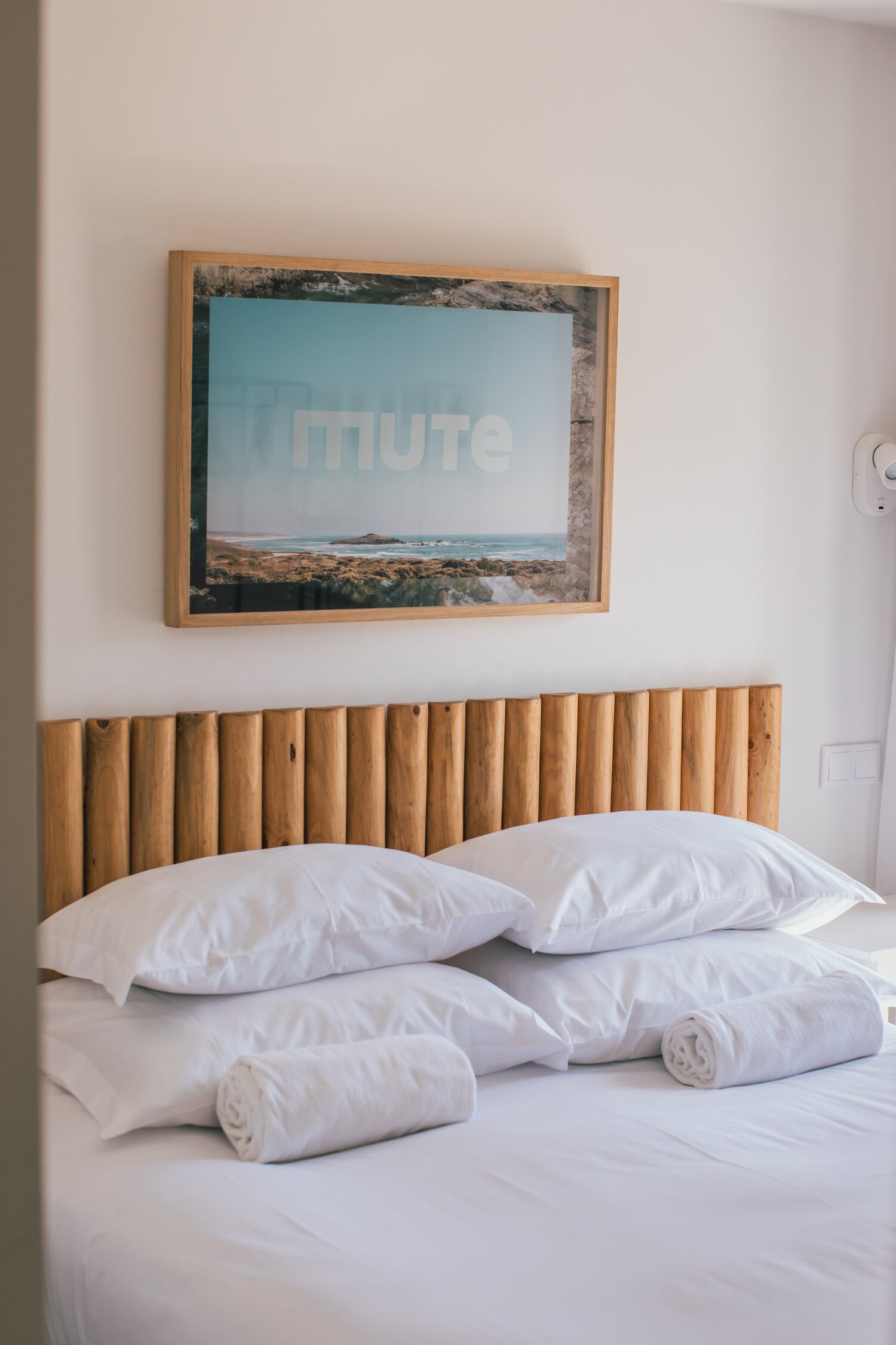
Here you can rest, while achieving your best.

And when you think about a deadline, shut down your brain, it’s fine.

You’re not out of time. You just need a time out.

Give your life, not yourself, a break.

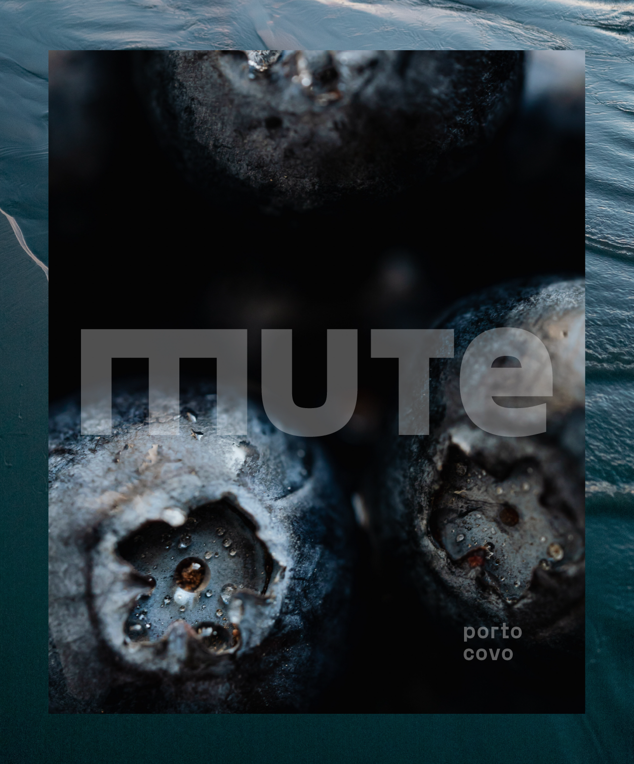
Put it on Mute. Not on silence.

MUTE. Active resting.